According to Global Marketing Insights, the e-learning market is expected to surpass $375 billion by 2026:
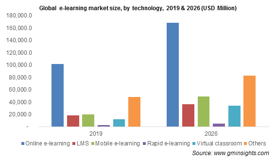
As online learning becomes increasingly prevalent worldwide, there has been a notable increase in digital advertising campaigns within the education sector this year and this fact attracted the attention of our team. In this article, the author highlights the advertising initiatives of five digital marketing courses and the valuable advertising insights one can glean from them.
- CueMath
- What can be gleaned from CueMath:
- Lessonly
- Lessonly teaches you valuable lessons:
- Codeacademy
- Key takeaways from Codecademy:
- Capella University
- What you can gain from Cappella University:
- Thinkific
- What you can gain from Thinkific:
- Full Sail University
- What can be gained from Full Sail University:
- Conclusion
CueMath
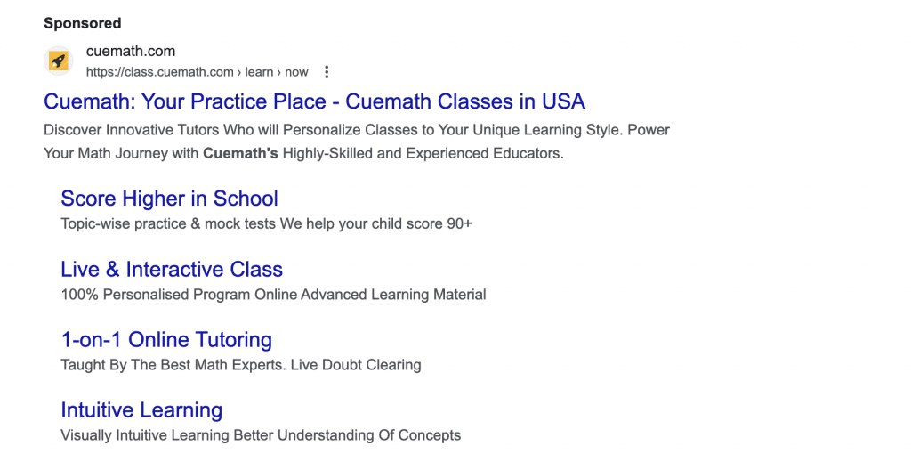
This CueMath Search advertisement offers a variety of educational options for children requiring assistance with mathematics, such as one-on-one tutoring, intuitive learning, and live classes.
This landing page follows the advertisement:
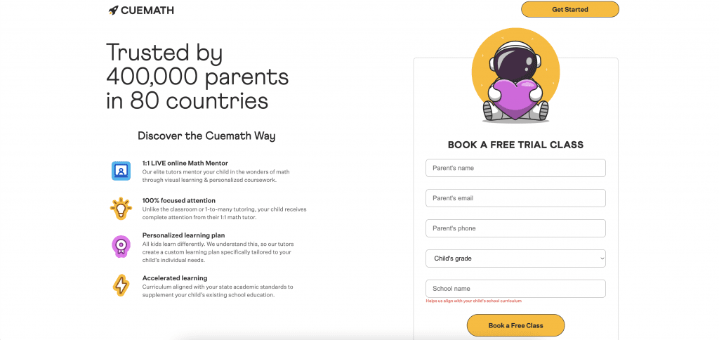
- The advantages mentioned in the advertisement and on the top part of the page are aligned with the message, matching both the offer and branding.
- The call-to-action buttons are prominently displayed and provide clear guidance for the user regarding the next steps. By the way, as evidence suggests, textual calls to action performed great in the seasonal weight loss campaign.
- The page does not contain any distracting navigation links.
- The headline statistic, “Trusted by 400,000 parents in 80 countries”, provides social evidence that their service is valuable.
- The content on the page can be quickly gathered.
What can be gleaned from CueMath:
The coherence achieved through the relevance of ads to the page instills a feeling of continuity, ensuring visitors that they have reached the correct destination. Additionally, the strategically positioned and visually appealing CTA buttons inform users that they can try the service for free by booking a class. By providing clarity on the subsequent actions, Cuemath minimizes uncertainty and motivates users to participate more actively.
Furthermore, the lack of distracting navigation links ensures that users stay on the intended conversion path, directing their attention exclusively towards the presented offer. Adding the headline statistic “Trusted by 400,000 parents in 80 countries” boosts the landing page’s credibility by showcasing social proof, which builds trust among potential users. A similar approach was taken when creating quiz landing pages for the advertising campaign launched by the Moonstar Network team. The idea was to stir up a user’s interest.
In summary, these strategies highlight the significance of upholding consistency, clarity, trustworthiness, and user-centered design when creating impactful landing pages.
Lessonly
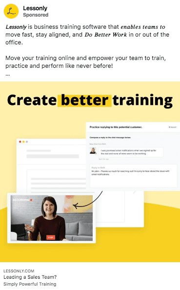
This Lessonly advertisement on Facebook assures visitors of providing the resources necessary to improve their training:
Subsequently, there is a landing page linked to this ad:
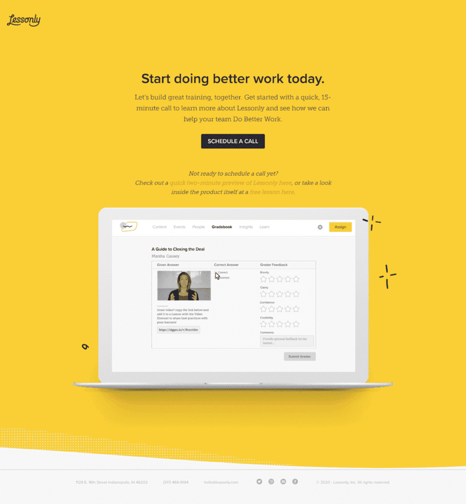
- The advertisement and the page maintain message alignment, both in relation to the offer and the branding;
- There are no interruptions on the page like some navigation links;
- The headline effectively conveys a tangible advantage: “Do better work” by creating effective training. The content of the advertisement assures this;
- The text communicates that the call will only take 15 minutes, ensuring users have a clear understanding of what to anticipate;
- The call-to-action button text clarifies the next action for the user;
- The secondary call-to-actions provide users with an alternative path to discover how Lessonly can benefit them if they are not yet prepared for the call;
- The GIF on the page offers a brief demonstration of some of the product’s functionalities.
Lessonly teaches you valuable lessons:
Lessonly employs a product GIF to showcase the platform’s benefits to users. This aids potential customers in picturing how they can use the platform. Display various usage scenarios on your landing pages, customized for specific audience groups, to craft a more individualized user experience.
Codeacademy
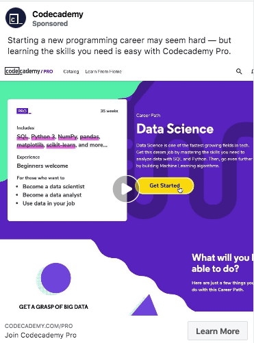
This Codeacademy advertisement assures users that acquiring skills for a fresh programming career will be effortless when using their Pro Account:
The advertisement guides visitors to this landing page:
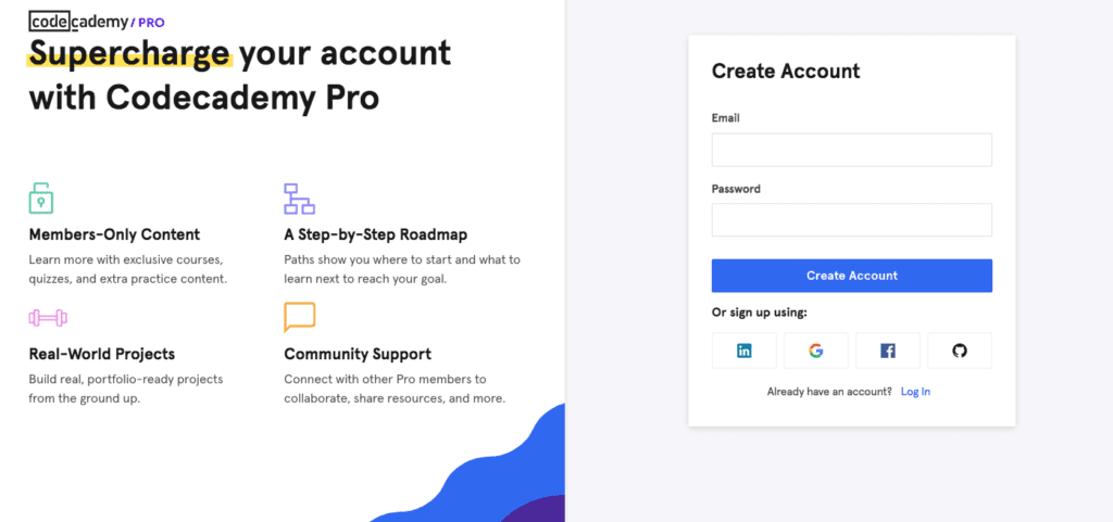
- The headline cuts to the chase: “Supercharge your account” with the full advantages of the pro membership;
- The text is presented in a format of concise bullet points, showcasing the advantages of the pro account;
- Filling out the lead-capture form is a breeze – simply enter your email and password, and you’re good to go. Users can also opt for alternative account sign-up methods for added convenience.
Key takeaways from Codecademy:
Simplicity is effective. Concentrate on the essentials and shape your content around the core page components to ensure an optimal user experience.
Capella University
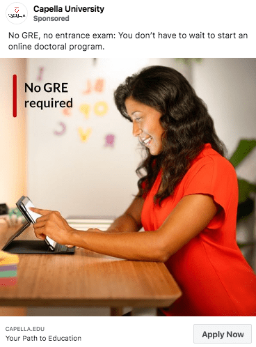
The Capella University advertisement assures individuals of an online doctoral program without requiring a GRE or an entrance examination.
Here’s the landing page linked to the advertisement:
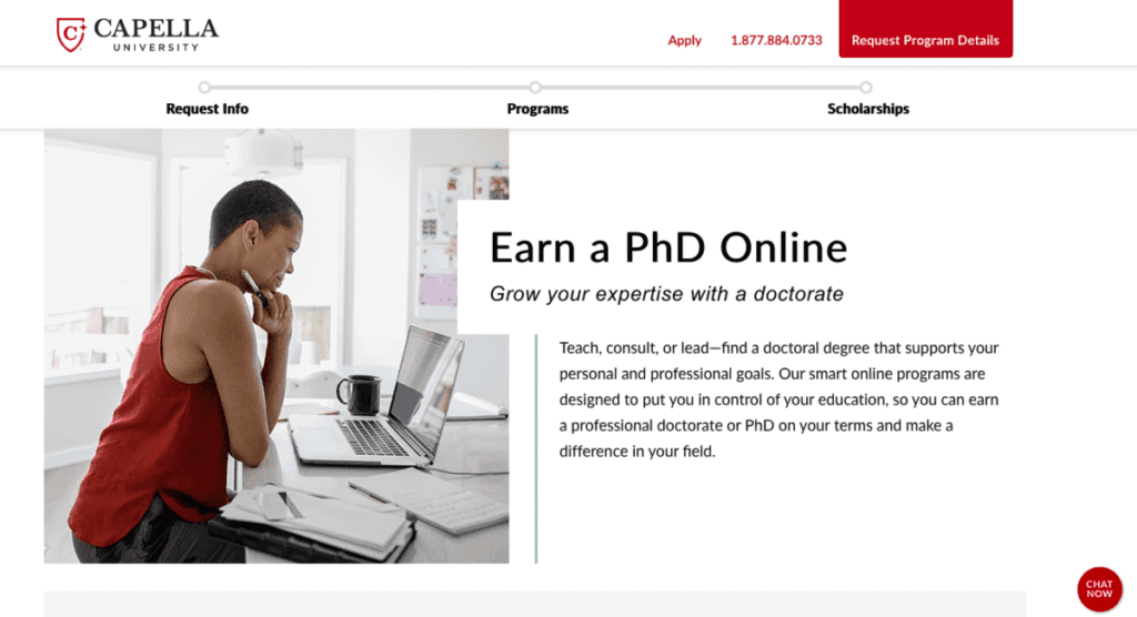
- The headline is concise and aligned with the advertisement: “Earn a Ph.D. Online”. The text below the headline elaborates on why the online doctoral program is an ideal choice for students seeking control over their education.
- The progress bar positioned at the top of the page simplifies user navigation through the lengthy content, enabling them to easily access their desired sections.
- The “Chat Now” button assists users in obtaining immediate responses to their inquiries.
- The “What Happens Next” section outlines the anticipated outcomes following the click of the CTA button.
- The accreditation list enhances the credibility of the offer.
- The statistic “92% of Capella alumni express satisfaction with their education” provides social evidence that their offer is valuable.
What you can gain from Cappella University:
Incorporating a live chat feature on your landing page enables users to receive answers to all their inquiries, facilitating a seamless progression towards engaging with the Call-to-Action (CTA) button. Live chats are particularly effective on pages where the primary offering necessitates a substantial investment of time or money.
Thinkific
This Thinkific advertisement provides potential users with a complimentary trial to experience firsthand how the platform can facilitate the efficient management of their remote training programs.
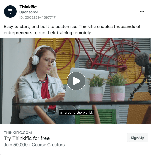
When users click on the advertisement, they are directed to this landing page:
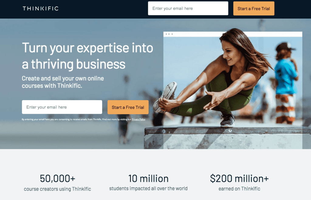
- The main title and sub-heading discuss the sale of online courses through Thinkific, which aligns with the Facebook ad’s offer.
- The “Start a Free Trial” call-to-action button is in perfect harmony with the message in the Facebook ad.
- The statistics highlight the platform’s popularity among customers and the earnings made from Thinkific courses.
- The calculator provides a precise monetary estimate of potential earnings for users who choose to utilize the service.
- The fixed navigation bar follows visitors as they scroll, allowing them to easily sign up for the free trial whenever they wish, without the need to scroll back to the top of the page.
What you can gain from Thinkific:
Demonstrating the potential impact of your service is more effective than just describing it. Thinkific achieves this by providing an online calculator that assists users in calculating their potential earnings.
Full Sail University
Full Sail University’s advertising campaigns are designed to boost student enrollment. The following advertisement presents an opportunity for individuals passionate about sports to pursue a bachelor’s degree in sportscasting.
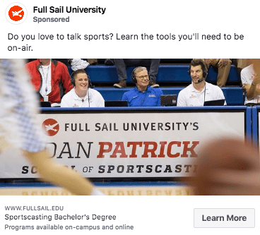
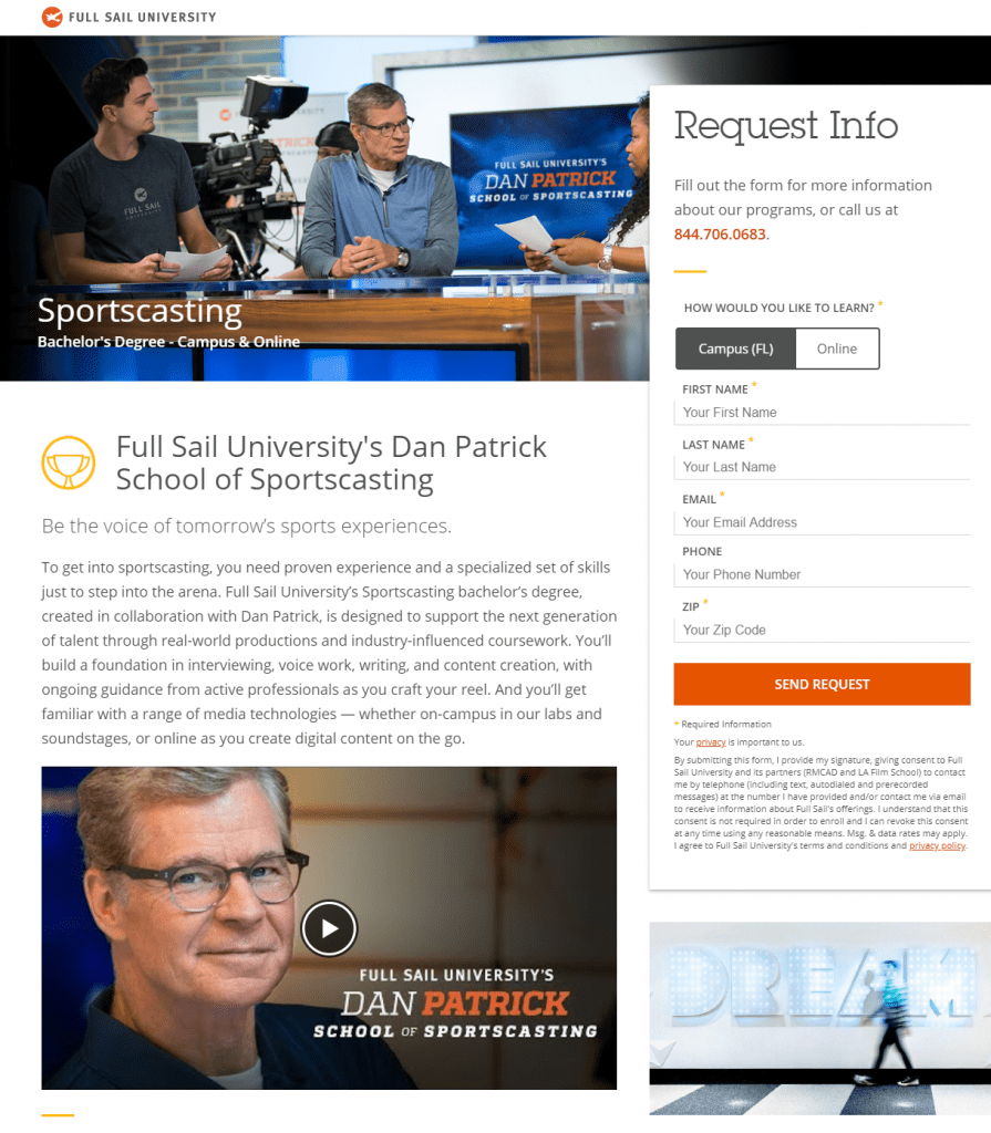
Users desiring to “Learn More” are directed to this landing page:
- The advertisement and landing page convey the same narrative. They both reference the “Dan Patrick School of Sportscasting” and prominently display his image.
- The sub-heading enhances the offer’s appeal by informing users that they can become the voices of future sports experiences. This aspiration is likely what initially attracted them to sportscasting.
- The page outlines the key areas of focus in sportscasting, the opportunity for students to complete their bachelor’s degree in just 20 to 29 months, and the potential to work in prominent sports entertainment venues.
- The video illustrates the support that users can expect to receive from Dan Patrick. His association and partnership with Full Sail reassure prospective students that pursuing this degree is worthwhile.
What can be gained from Full Sail University:
Incorporating video content on your landing page enables users to engage with your message through a more persuasive medium. It is essential to ensure that the video’s content is in harmony with your offer, ensuring it is effectively positioned to drive advertising conversions for you.
Now, if you want to give a try in the education niche, take a look at our top-list of education affiliate programs & networks.
Conclusion
In our article, we’ve examined six different cases of advertising campaigns in the education vertical. Each case showed approaches to creating a good user experience while navigating the landing pages. The key things we’ve learned are transparency of the page (the user has to easily scan the page and understand what they are being offered) and proper call to action (the user has to feel the urge to do something that you would like them to do). If you are not fond of the education vertical, you can go for a dating offer like this one.
