Ad creatives for nutra offers are the key to successful traffic monetization. But every affiliate knows: for an ad to perform, it’s not enough to catch the audience’s mood — you also need to consider the specifics of the offer and GEO. And since nutra is one of the best verticals in affiliate marketing, you should learn how to create high-converting creatives, adapt approaches for specific tasks, and achieve maximum results.
- What Nutra Ad Creatives Should Look Like: 3 Examples
- Example 1: Teaser Format + Associations
- Example 2: Teaser + Medical Approach
- Example 3: Classic ‘Before/After’ Approach
- Ad Creative Features by Offer Type
- Weight Loss
- Joint Pain Remedies
- Adult
- Beauty
- Features of Making Ad Creatives for Different Traffic Sources
- Social Media
- Teaser Ads
- Push Notifications
- Contextual Ads and Ads on Websites
- What a Nutra Ad Creative Should Look Like on Facebook
- How to Make Nutra Ad Creatives That Convert
- How to Make Ad Creatives for Other GEOs
- Conclusion
What Nutra Ad Creatives Should Look Like: 3 Examples
Nutra ad creatives vary greatly — affiliates constantly test new angles, play on audience emotions, and tailor materials to match the offer. The main goal is to grab attention and spark the desire to buy a “magic” remedy. To understand which approaches, texts, and visuals convert today, you need to build visual literacy and learn from real examples.
Example 1: Teaser Format + Associations
The first creative uses a classic teaser approach: attention is drawn with an unusual image, intriguing text, and a promise of a quick solution to a problem. The affiliate also added strong triggers: fear of addiction and the natural composition of the product. These kinds of ad creatives work well in Tier-3 GEOs, where people tend to trust traditional remedies and natural solutions.

In the foreground, there’s a jar of tincture — this instantly evokes associations with home remedies and gives a sense of the product’s natural origin. Additional elements like lemon and garlic enhance this effect, as they’re well-known for their health benefits.
The ad creative features a man in a white shirt labeled as Dr. Péter Pál Varga. This adds authority and creates the impression that the remedy is doctor-approved. Authorities, celebrities, and news-like approach always enhance trust.
In the top corner, there’s a circle with a hand refusing alcohol — a strong visual trigger reinforcing the creative’s core message. The text highlights keywords like “alcoholism” and “2 days,” which immediately grab attention and convey the offer’s essence.
This promo material performs well due to its simple, straightforward solution that requires no complex explanation. The use of psychological triggers and emotional appeal also play a role — tackling alcoholism resonates strongly, especially with the 40+ audience. For improvement, the visual could be simplified, the promise made more realistic, and a clear CTA added.
Nutra often overlaps with E-commerce, so if you’re new to these niches, you can read more in our full guide on E-commerce.
Example 2: Teaser + Medical Approach
In the foreground, elderly people are shown with a mysterious compress on their knees. This immediately raises questions and sparks curiosity — you want to know what this method is and how it works. At the bottom, a doctor is shown recommending the treatment. This combination increases trust in the ad creative by adding a layer of expert validation.
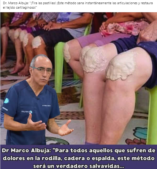
The text emphasizes relief from joint pain to immediately attract the target audience. The phrase “throw away your pills” adds an emotional punch — it creates the sense that a revolutionary treatment method is about to be revealed.
These kinds of ad creatives perform well in Tier-3 countries, where people tend to trust natural remedies and are looking for affordable ways to manage pain. To improve effectiveness, the image could be made less off-putting, more context could be added about the treatment method, and the call to action could be strengthened.
Fresh case studies in Nutra with relevant funnels are in this article.
Example 3: Classic ‘Before/After’ Approach
This promo uses a visual metaphor — loose-fitting clothing transforming into a tight swimsuit. It’s a simple and clear image that instantly conveys the idea of weight loss and achieving a slim shape quickly. This approach often works better than real photos and generates less skepticism. Plus, it helps reduce the risk of getting banned.
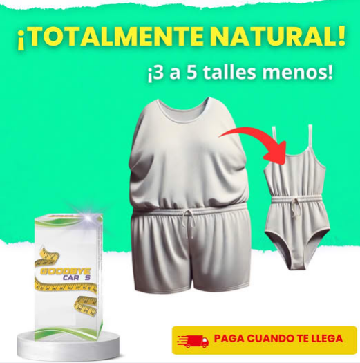
The creative is clearly aimed at Spanish-speaking countries, where buyers tend to trust promises of instant weight loss and are open to ordering products with cash on delivery.
The color scheme is bright and attention-grabbing. The use of green subconsciously conveys the idea of a natural weight-loss product. There’s very little text, but the main promise — “3–5 sizes smaller” — is emphasized. The phrase “Pay on delivery” lowers the psychological barrier to purchase. The product itself appears in the lower-left corner, but it doesn’t play a central role.
This kind of creative grabs attention through the contrast in clothing sizes. The simple visual makes the message clear even without reading the text. However, there are weak points: the image is too abstract, there’s no headline, and no clear call to action. Adding more specific details to the concept — such as real results, a guarantee of effectiveness, a strong headline, and a powerful CTA — would likely improve conversion.
Ad Creative Features by Offer Type
The nutra vertical includes offers related to health and beauty, but several core categories can be distinguished: weight loss, cosmetics, adult products (potency, enlargement, prostatitis, etc.), and treatments for various conditions (joint pain, diabetes, hypertension, etc.). To make an ad creative perform well, you need to understand the audience’s pain points and play on them effectively.
By the way, a deeper research on how to promote nutra offers is given here.
Weight Loss
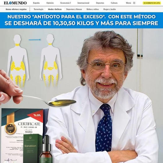
The main pain point is excess weight and the inability to get rid of it quickly. People are looking for an easy way to slim down without exercise or diets. Effective triggers include: promises of fast results, before/after effects, and ease of use.
Texts often feature promises like “3 kg overnight” or “drink in the morning – lose weight during the day”, while visuals show body transformations or melting fat.

Joint Pain Remedies
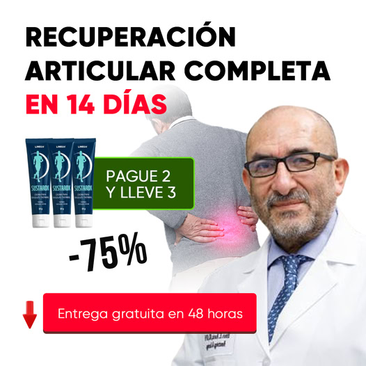
The target audience is 35+, most often suffering from knee, elbow, or back pain. You’ll need to show what problem the product solves: the creative highlights the painful area, emphasizes the natural composition, and the ease of use.
Trust is increased with a before/after effect — for example, a person struggling to walk is later shown moving freely or running.

Adult
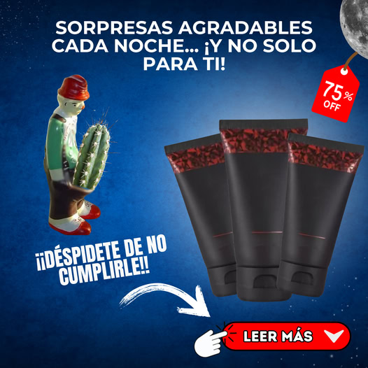
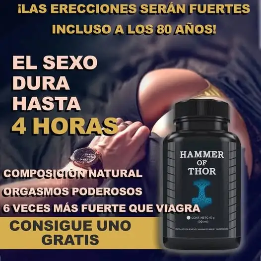
Men are looking for confidence, stability, fast effect, and safety. Hints and associations work best here: rockets, lightning bolts, upward arrows, satisfied women.
Since many platforms ban explicit advertising, affiliates often use visuals with double meaning — symbols and metaphors that imply the benefit without violating moderation rules.
Beauty
The female audience is concerned about wrinkles, hair loss, and pigmentation spots. Visuals that attract attention include before/after contrasts, glowing skin, and voluminous hair. Common triggers used: “secret of youth,” “rejuvenating effect,” “natural ingredients,” etc.
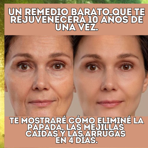
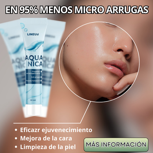
For all categories, you’ll need to show the problem, offer a simple solution, and give a visual effect. The simpler, clearer, and more convincing you do this, the higher the CTR.
Features of Making Ad Creatives for Different Traffic Sources
The same offer can be delivered in different ways. But not all formats will work for a specific traffic source. Each placement has its own limitations, audience, and engagement mechanics. Somewhere, a personal story works better, and for other source, expert content is best. And in some cases, the only working option is clickbait and misleading techniques. The main rule: adapt the ad creative to the specifics of the platform, and don’t try to force a universal approach everywhere.
Social Media
Social media give access to a huge audience, but they strictly moderate content. The choice of platform depends on the GEO and the age of the audience your offer is targeting. It can be Facebook, Instagram, TikTok, etc. The following approaches work well on all platforms:
- Before/after stories — the experience of a person who solved a problem with the help of the product. Suitable for weight loss offers, skincare, and health-related products.
- Real-life stories and photos — storytelling and images without obvious advertising, resembling user-generated content. Such posts get more reach than banner ads.
- Influencer/blogger integrations — often give the best result. The budget is higher, but you don’t have to fight ad account bans.
Teaser Ads
Teasers work through intrigue — a short ad with an image and text meant to provoke a click. There’s no strict moderation here, so you can test bold ideas. Clickbait headlines perform well, as do unfinished stories like “a simple method to forget about diabetes forever…” and misleads — news-style ads, pseudo-scientific discoveries, “secret” techniques.
Push Notifications
Push notifications are pop-ups seen by the user. They must be as concise and catchy as possible. Provocation and urgency work well. The main rule for pushes — minimum text, maximum intrigue.
Contextual Ads and Ads on Websites
Ads placed on niche websites should create a sense of expertise. A person reading about health or diets is more likely to believe a recommendation if it looks authoritative. That’s why the medical approach works well here — imitation of reviews, doctor recommendations, medical overviews.
What a Nutra Ad Creative Should Look Like on Facebook
Advertising on Facebook requires a special approach to creatives, as moderation strictly filters prohibited content. To pass approval, you must consider several important points.
The visual part must be as natural as possible and must not include explicitly medical images. Pictures of unpleasant symptoms, wounds, inflammation, pus — may get banned. It’s better to use neutral visuals: a person with an unhappy facial expression, product images, etc. Lifestyle images where users of the product are shown in natural settings work well.
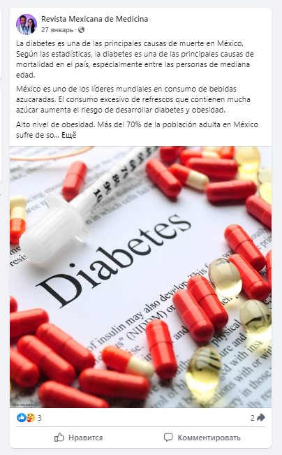
The text must not contain direct medical claims. You can’t say that the product cures or guarantees to eliminate a problem. Instead, use veiled formulations such as:
“Feeling discomfort? Try a natural remedy” or “More than 1,000 satisfied customers have already noticed the effect.”
A good tactic is to add questions that resonate with the target audience.
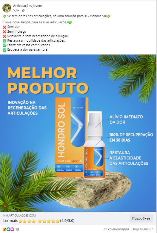
Creative formats on Facebook are diverse, but the best results usually come from videos and static images. The ad creative should blend into the feed and doesn’t look like a direct advertisement. The more natural the presentation, the higher the chances of passing moderation successfully.
How to Make Nutra Ad Creatives That Convert
Converting ad creatives always catch users’ attention — they trigger emotions, highlight a problem, or leverage authority. Here are some approaches that help webmasters achieve high CR rates:
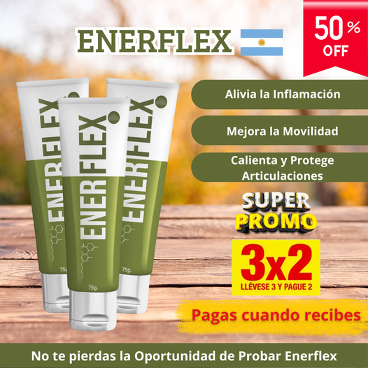
Product-focused approach — emphasize the product. The buyer should immediately understand what exactly they are getting. This can include packaging, a demonstration of how to use it, or a focus on key features: natural ingredients, instant effect, proven efficiency. Adding a discount, limited stock, or exclusive offer increases impact.
Expert-based approach — opinions from specialists trusted by the audience. Doctors work best, as their authority in medical topics is unquestionable. Creatives can show a doctor in a white coat, a prescription form, a patient consultation, or even a group discussion of the issue among doctors. Sometimes the image of a celebrity or another public figure is used instead.

Symptomatic approach — playing on the recognizability of the problem. The person sees familiar symptoms in the creative. For example, joint pain, inflamed papillomas, varicose veins, and immediately associates them with their own condition. This approach works well with diseases that have clearly visible external signs — diabetes, dermatological issues, joint disorders, etc.
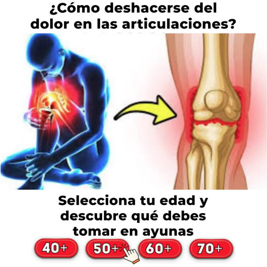
Consequential approach — warning about potential consequences. If you don’t buy this product, things will only get worse: varicose veins lead to thrombosis, papillomas can turn into cancer, and potency issues may result in complete infertility. You can also emphasize not only health risks, but social consequences as well: failures in personal life, loss of attractiveness, judgment from others.

News-based approach — using a media/news format. Creatives are designed to look like breaking news, scientific discoveries, or sensational exposés. This approach works especially well with older audiences who tend to trust news-style content and are more likely to click through to a pre-landing page for further product exploration. Elements of TV broadcasting are often used — news anchors, ticker lines, infographics.

Before/After approach — a visual demonstration of results. For example, a comparison before and after weight loss, improved skin condition, disappearance of symptoms, etc. It’s important that the difference looks convincing but not fake.
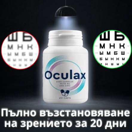
How to Make Ad Creatives for Other GEOs
The same offer can be run in different GEOs. But simply translating the ad creative’s text is not enough. You need to take into account the cultural and linguistic nuances of the region.
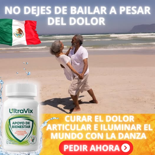
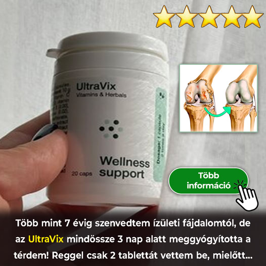
For a basic translation into any language, there are dedicated tools and AI tools. But their level isn’t enough — you need to consider local dialects and, in some cases, slang. The same word can be interpreted differently even in countries that share a language. For example, text that’s clear in Madrid might seem awkward or even offensive to an audience in Mexico or Argentina, although these countries speak Spanish.
Beyond language, cultural adaptation is crucial. Memes, jokes, and some visual elements in ad creatives may trigger a negative reaction among local users — or simply be misunderstood. Here are just a few examples:
- In Spain, the word “coger” means “to take,” but in Latin America, it’s a crude slang term. Using this in an ad could cause confusion at best.
- In China, red symbolizes luck and wealth, while white represents mourning. This should be considered when selecting your creative’s color palette.
- For Baltic countries, promo materials should be as calm as possible. But such approach will never work for LatAm countries.
- U.S. audiences are used to strong CTAs like “Call now”, “Don’t miss out”, etc. But in European countries, such a style may feel aggressive or off-putting.
- In some Middle Eastern countries, visuals of women in revealing clothes are unacceptable.
To understand which creatives perform well in your target GEO, you can use spy tools like MTWSPY, AdHeart, FBtool, etc. Affiliates use these platforms to analyze popular combinations and get inspiration from competitors.
Conclusion
A high-quality ad creative isn’t just an image with text. It’s a precise hit on the audience’s desires and pain points. The better you tailor your approach to the GEO, traffic source, and audience, the higher your conversion rate will be. Test different formats, follow trends, and don’t be afraid to experiment — that’s how you find combinations that deliver the highest profit.

Ksenia has extensive hands-on experience in affiliate marketing, having worked as a media buyer and affiliate for several years across multiple verticals. Throughout her career, she managed traffic from a wide range of sources, tested funnels, and collaborated directly with advertisers and networks.
For the past six years, she has also been writing in-depth articles, reviews, and analytical guides about affiliate marketing. Her work has appeared on well-known industry blogs and platforms, where she covers topics such as traffic sources, compliance, creatives, tracking, and campaign optimization.
Today, Ksenia combines practical experience with editorial expertise, contributing as a guest expert to various affiliate marketing projects and helping educate both beginners and experienced affiliates.


